Color Contrasts and Perceptions
Illusions

Color Theory - Palette Picker
1. Explain the three ways to describe color.
Color can be described by its name, saturation/desaturation or by its value.
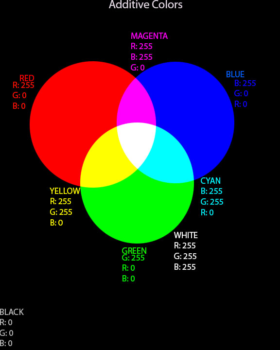
2. Compare and contrast subtractive and additive color systems.
Subtractive colors make black when mixed together but additive color systems will create white when mixed together. Subtractive colors are additive colors mixed with each other.
3. Define the following terms:
Primary colors – Colors that can not be created by mixing other colors; pure colors.
Secondary colors – Colors that can be created by mixing two primary colors together.
Tertiary colors – Several primary colors mixed.
Complementary colors – Colors opposite each other on a color wheel. Opposite colors.
Analogous colors – 2 or more colors adjacent to each other on a color wheel.
4. Which colors are warm and which colors are cool?
Warm colors include: Red, orange, yellow
Cool colors include: Blue, green, violet
5. How are vibrating boundaries created?
Two opposing colors are put next to each other.
6. Describe what happened when you did the after burn image. Why does this happen?
I saw the picture very faint and in the colors opposite to the original colors. This happens because your eyes get tired of staring at one color for a long time so it shows the negative of that color when you look away.
7. What are the different relationships between colors?
Monochromatic- tints/shades of a color.
Complementary- Colors opposite each other on the color wheel.
Split-complementary- two monochromatic colors across from the opposite color.
Double-complementary- Two sets of complementary colors. Affects contrast of final picture.
Analogous- Colors grouped next to each other on a color wheel.
Triad- Three hues equally spaced on a color wheel.
8. When creating text, how much contrast is needed for readability?
80% contrast
9. What are the seven types of contrast?
Saturation, light and dark, extensions, complements, simultaneous contrast, hue, primary hues, warm and cool.
10. How can you create an accent color?
Create a small area of contrast by variation of the hue, intensity, or saturation
11. Explain the difference between contrast dominance and value dominance.
The contrast means the colors will be brighter or more contradicting. Value will either make the picture look lighter or darker.
12. Look at the page, Colors Shades and Tints, what are your impressions of the different interpretations of the same drawing. Which is your favorite and why?
My favorite is the last one (high contrast, light value, using shades, tints & various saturation levels) because I like the colors best and they go well with each other.
13. Look at the page, Colors Studies, what are your impressions of the different interpretations of the same drawing. Which is your favorite and why?
I like the one with color intensity and saturation modified because I like the pastel colors together and the lightness of it.
Color can be described by its name, saturation/desaturation or by its value.
2. Compare and contrast subtractive and additive color systems.
Subtractive colors make black when mixed together but additive color systems will create white when mixed together. Subtractive colors are additive colors mixed with each other.
3. Define the following terms:
Primary colors – Colors that can not be created by mixing other colors; pure colors.
Secondary colors – Colors that can be created by mixing two primary colors together.
Tertiary colors – Several primary colors mixed.
Complementary colors – Colors opposite each other on a color wheel. Opposite colors.
Analogous colors – 2 or more colors adjacent to each other on a color wheel.
4. Which colors are warm and which colors are cool?
Warm colors include: Red, orange, yellow
Cool colors include: Blue, green, violet
5. How are vibrating boundaries created?
Two opposing colors are put next to each other.
6. Describe what happened when you did the after burn image. Why does this happen?
I saw the picture very faint and in the colors opposite to the original colors. This happens because your eyes get tired of staring at one color for a long time so it shows the negative of that color when you look away.
7. What are the different relationships between colors?
Monochromatic- tints/shades of a color.
Complementary- Colors opposite each other on the color wheel.
Split-complementary- two monochromatic colors across from the opposite color.
Double-complementary- Two sets of complementary colors. Affects contrast of final picture.
Analogous- Colors grouped next to each other on a color wheel.
Triad- Three hues equally spaced on a color wheel.
8. When creating text, how much contrast is needed for readability?
80% contrast
9. What are the seven types of contrast?
Saturation, light and dark, extensions, complements, simultaneous contrast, hue, primary hues, warm and cool.
10. How can you create an accent color?
Create a small area of contrast by variation of the hue, intensity, or saturation
11. Explain the difference between contrast dominance and value dominance.
The contrast means the colors will be brighter or more contradicting. Value will either make the picture look lighter or darker.
12. Look at the page, Colors Shades and Tints, what are your impressions of the different interpretations of the same drawing. Which is your favorite and why?
My favorite is the last one (high contrast, light value, using shades, tints & various saturation levels) because I like the colors best and they go well with each other.
13. Look at the page, Colors Studies, what are your impressions of the different interpretations of the same drawing. Which is your favorite and why?
I like the one with color intensity and saturation modified because I like the pastel colors together and the lightness of it.
Additive Colors